The Elf Workshop – SHelf

Developing our idea to create an experience for the audience that helps to break away from the busy shopping period, we have come up with an overriding theme. We want turn the rebooted space into an Elf workshop. Using the play on words of shelf and elf – SHelf, the workshop will have a focus on the production line that presents go through.  Visitors will be able to browse through our works that will be situated at different stations around the room. Each station will be a different packing/wrapping stage that the Elves go through in preparation for delivering gifts at Xmas. This concept is in keeping with the browsing experience and also ties in with the festive period. Although still having some emphasis on products, it removes the pressure of having to make choices as there is no purchasing of the products involved. We think that this could be a very unique and enjoyable experience for visitors and would appeal to both a younger and older audience. The younger being attracted more to the elf workshop theme and the older being able to enjoy the students artwork.

Visual Research


For the presentation, I drew up some rough concept ideas to help visuals our idea to the audience.


First crit’ – Reevaluating our idea

After our first crit, and after evaluating our idea a little, we think that our concept needs more direction. At the moment there is no real stand out quality so maybe introducing a solid, overriding theme could help. We also need to think more about how to engage passers by and how to persuade them to come into the shop.

Task one – Idea Development

Things for us to consider:

This is not a gallery

The audience are shoppers

Disused shop

How do you draw people in (cross the threshold)?

How do you keep people within the space?

How does the display engage with the audience?

Overall, what do you want people to experience?

Thinking about the above statements, we felt that concentrating on creating a nice and enjoyable atmosphere within  the space would be the best way to go forward. By doing this we could create an experience for the audience that would be in keeping with the ‘browsing experience’ theme and also be something that the audience benefit from. Baring in mind that our the space will be in the middle of town during the Xmas shopping period, we wanted to create an experience that would be a break from the stresses that this busy shopping period can causes. We wanted to offer shoppers a chance to forget having to purchase things for a while and just enjoy the browsing experience for what it is.

Following on from our initial idea, we began looking at different spatial design and visual merchandising ideas that are aimed towards creating a fun, relaxed, stress free environment and emotions.

We found that a lot of these minimalist spaces also incorporated an industrial look. Because of this, we also researched into the types of materials we could use to create this sort of space. We found that copper piping could be a viable option as it is fairly cheap and easy to get hold of and can be used in a number of ways.
 

Responsive – the brief

Collaborating in groups, our task for this module is to come up with and curate a overriding concept for our Xmas exhibition of our Visual Literacy work. The exhibition will take place in the rebooted (disused boots store) space in Bradford. Our concept needs to be a browsing experience and not a gallery or exhibition. Approaching the event in this unique way should help attract a varied audience and help overcome the audience/event space threshold.

Task One – Come up with a concept/theme for the event in our groups and then pitch our idea against other groups.

Task Two – After being split into groups with specific tasks to do, work as a team to make sure these are completed for the event.

Text Development

deer text-01.jpg

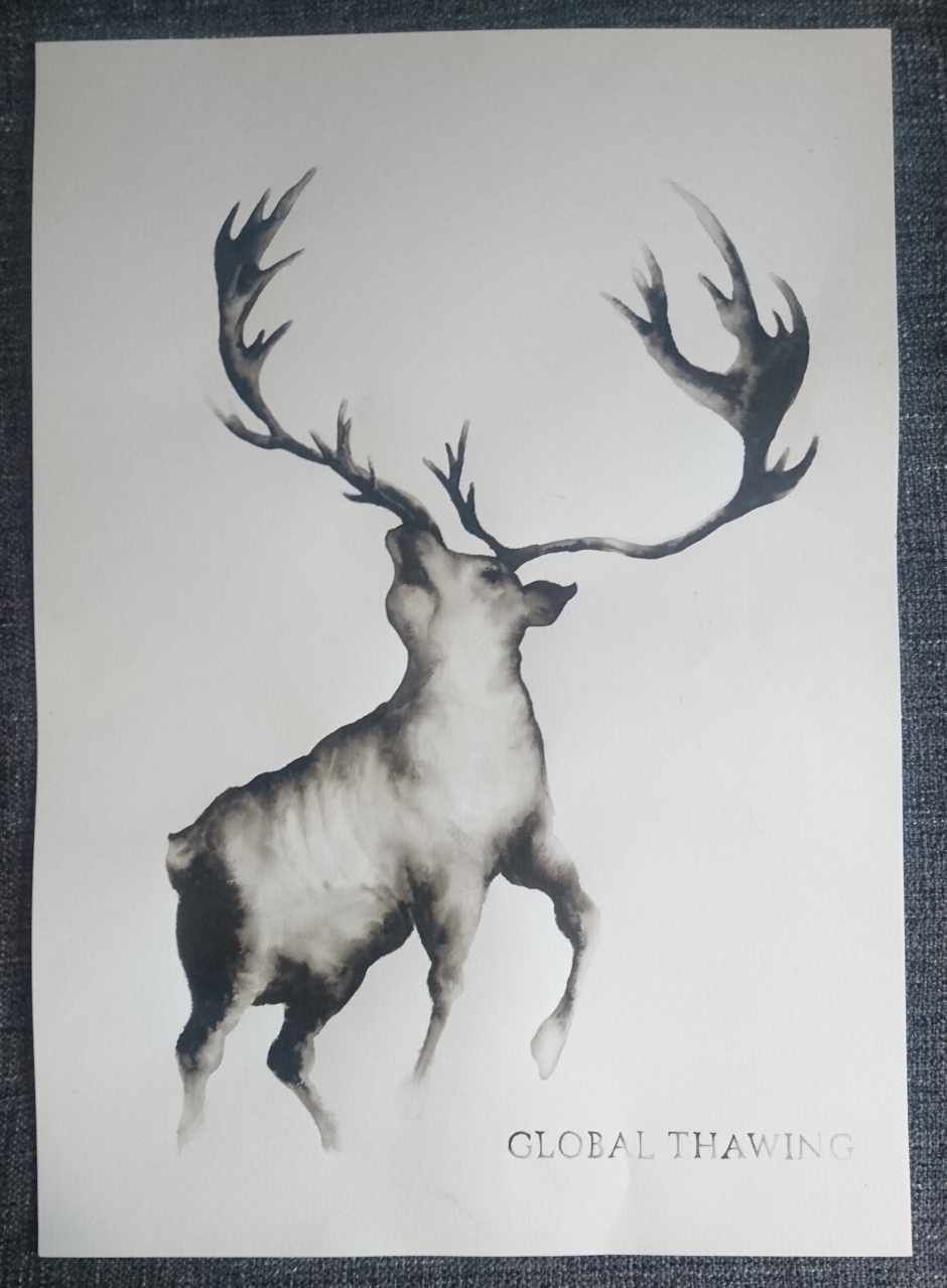
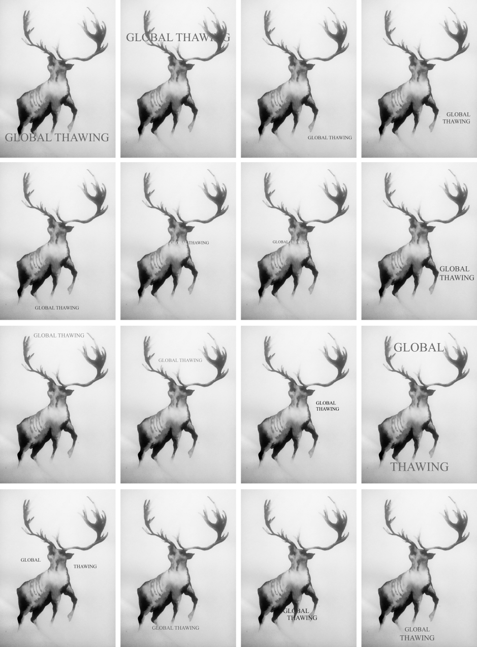
I included text to help add context, an aid to the image, nothing more. Because of this I have opted to use a small font size in an uncentered position as not to draw too much attention away from the image. I have also used a serif font style as I wanted to carry over the elegant and serious feel that the image itself holds. I also opted to paint the letters in a similar fading style as the image. As well as not being too bold and prominent, I also think this upholds the feelings of unease and loss.
Group Crit + Reductionism lecture

A COP lecture on Reductionism drew my attention to how less is more. It raised the sort of techniques used in advertising and graphic design to get a specific message across quickly. How reducing the amount of information can provide a clear message that gets straight to the point, without risk of confusion. This is exactly the approach I needed to take to my work considering the context of the piece in the exhibition, along with the audience it has the possibility to reach.


A group crit allowed me to test how adding text to my image changed the audience’s opinion on what the piece was about. This allowed me to pick the phrase ‘GLOBAL THAWING’ as this was when everyone was in agreement to what my piece related to. I then went on to to change the text to ‘THE THAWING OF A PLAGUE’ and then added some facts from the news stories. This created confusion. From this I learnt that commenting on climate change in the Arctic in general is going to be a much more powerful message to make. By tackling a larger issue, I am able to reduce the content right down to the bare minimum due to the fact of my audience’s existing knowledge.